

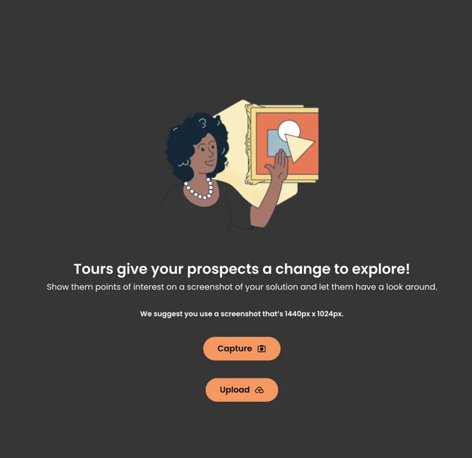
Tours help build engaging stories for your product and services.
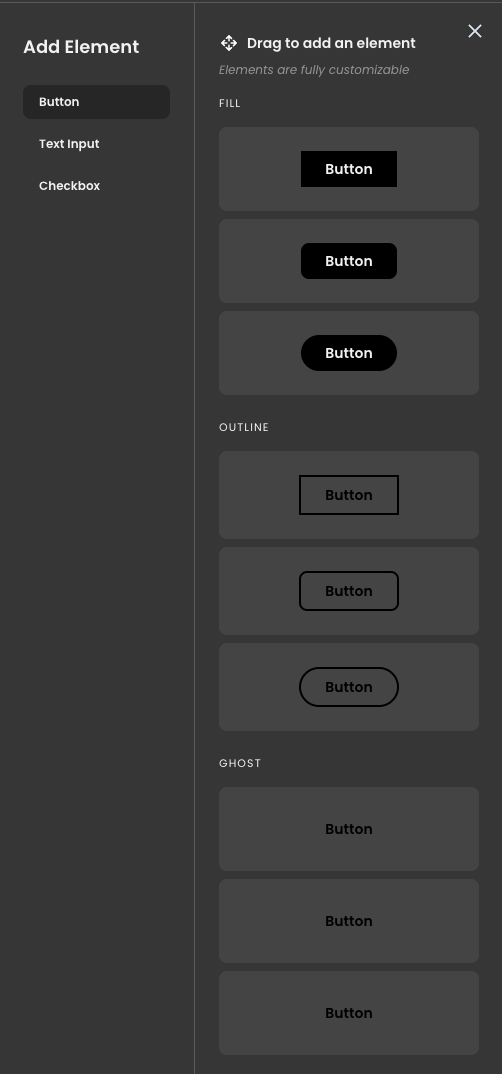
Inside the Tours feature, you'll find three interactive elements:
- Hotspots
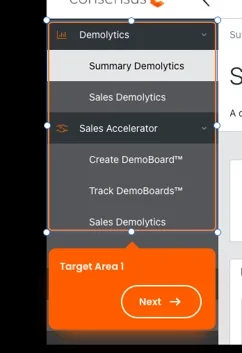
Hotspots - Target Areas
Target Areas - Interactive Live UI
- Button
- Fill, Outline, Ghost
- Text Input
- Simple, With label, with placeholder, search
- Checkbox
- Checked or unchecked states
- Button
In the Live UI element tray located on the left-hand panel, you'll discover a variety of preset elements that you can choose from. Once you've selected a preset element, you can further customize it to your preferences.
Getting Started
Once you're inside the Tours Builder, you'll have the option to "Browse Files," "Drag & Drop" pages, or capture screens for your Tour. To learn more about chrome extension click here.
Note: the recommended screenshot size is 1440 px X 1024 px
Within the floating navigation bar, you have the capability to create various interactive elements, such as hotspots, target areas, or add live UI elements.
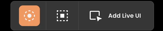
- Hotspot Icon

Hotspot Icon - Target Area Icon

Target Icon - Live UI Icon

Live UI Icon - Button
- Text Input
- Checkbox
After selecting an element, you can create a guided/story Tour by choosing the "Add to story path" option. This enables you to guide viewers through the Tour in the order you prefer by having this option selected. You can also switch to "Independent Link" to link elements onto different pages as well. If you'd like to create a Tour that allows users to explore the different elements without guidance, simply turn off Link toggle.
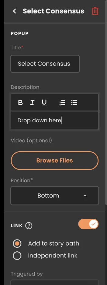
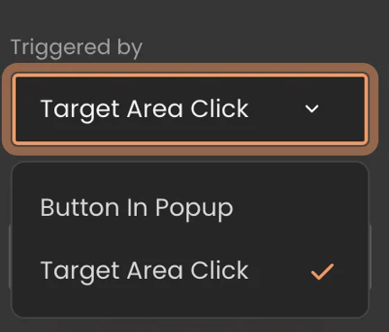
Within this right hand panel, you can also pick how your Interactive elements be triggered.
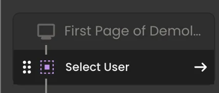
Once elements are linked, you'll notice an orange linkage icon displayed next to the elements that are connected.
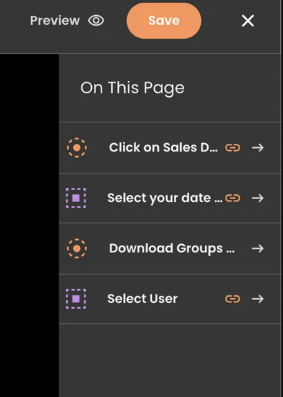
Within the left-hand panel, you can easily reorder the interactive elements by hovering over the desired element and then dragging and dropping them to arrange the order in which you'd like viewers to navigate.
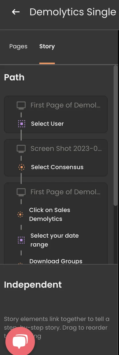
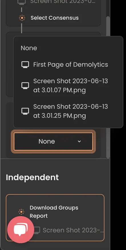
You also have the flexibility to drag any interactive element within the story path and switch it to an independent element, and vice versa. Additionally, you can optionally select the page where you want the story to conclude by choosing it from the dropdown menu.
Adding Hotspot
Note: Hotspots can only be triggered by buttons within the popup.
Adding Target Area
Note: "Target Area Click" is the default trigger for target areas, but you also have the option to select "Button in Popup."
Interactive Live UI
Note: Live UI elements must always be associated with a Story Path and cannot be set as 'Independent.' In the "Style" configurations for Live UI elements such as buttons, checkboxes, or text input, you can modify various settings based on your selections.
How does Tours look like as a viewer?
To learn how to screen capture screens using Chrome Extension click here. To upgrade your Tours, please contact sales@goconsensus.com for more information.