

Setting-by-setting Guide to Dynamic Tour Brand Settings
This article will cover everything you need to know about setting up the Brand Setting properly in ReachSuite and Consensus for Dynamic Tours and Discovery Demos.
Brand settings are access in two places for first inside of ReachSuite Under Settings > Brand Color Theme found in the left navigational menu or if you click Create and select Discovery Demo and navigate to step for Demo Style Settings.
First we will cover off the ReachSuite settings but it is important to note that Demo Style Settings will override the ReachSuite Brand Color theme.
ReachSuite breaks their brand color themes into several sections. The first is Global Styles.
The Primary and Secondary options here are legacy settings and will be sunsetted as we move towards a full brand settings migration into Consensus.
The background, border, and text colour all control the styling of the Full Screen Callouts within a Dynamic Tour. The border controls the colour of the edge of the callout, the background controls the background of the callout and the text controls the text color which is fairly self explanatory and we won’t call the out as directly in future sections outside of the images we will reference below.
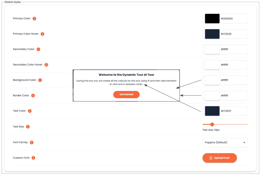
The text size, and font family, however, do apply globally. The means it affects everything from full screen callouts, normal callouts, discovery demo text fonts, and anywhere you see font in a Dynamic Tour.
You also have the ability to upload your own custom font but these fonts most be found in the Google Font library. Be sure to grab a font file that has bold, italics, etc., in it for the font responds with basic text edits.
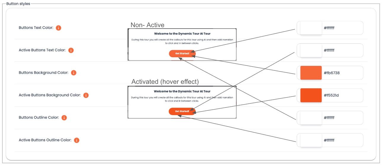
The next section is Button Styles which controls the buttons in the fullscreen callouts within the Dynamic Tours. These are fairly self explanatory but the biggest piece to look out for is to realize the Active identifier refer to what the button should look like in a hover state.
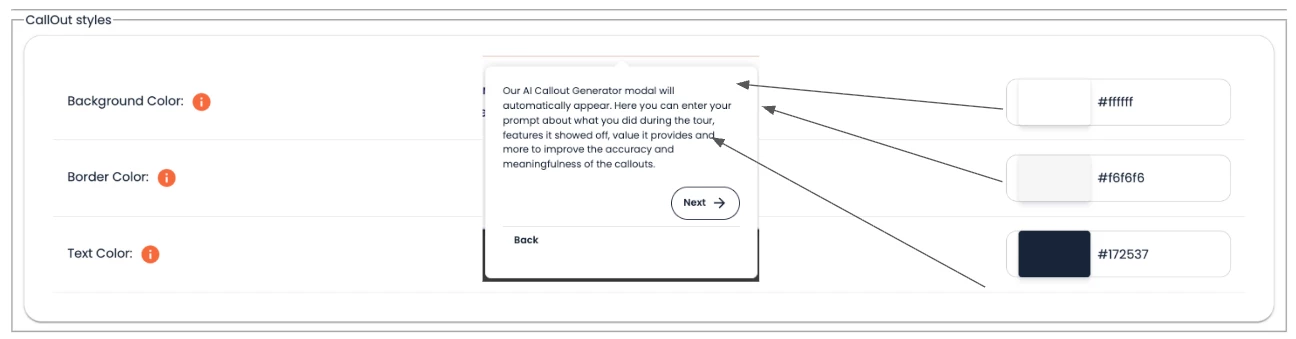
The Callout Styles is next and are the easiest of all the settings. These control the non-full screen callouts within the Dynamic Tour are control the following ares:
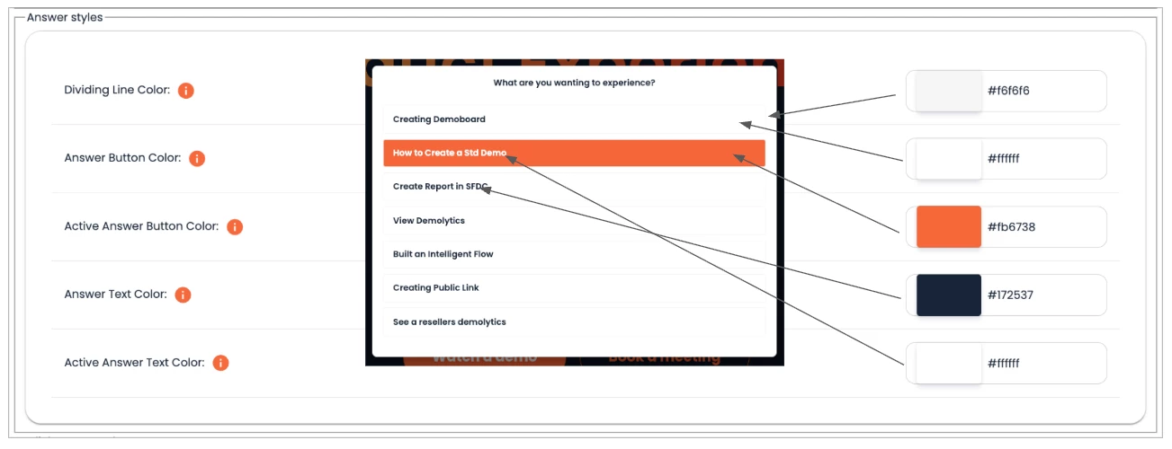
The Answer Styles section controls the Discovery Flow options. The diving line colour acts as the boarder framing the non-activated buttons. The answer button and text colour controls the non-activated button colours. It is best to match this to the colour of the background of your callouts. The active button and text color options control what the button looks like when it is in a hover state.
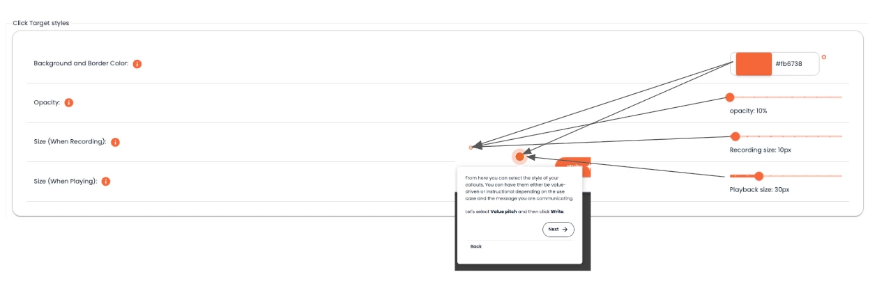
The Click Target Styles is the last section. It is important to note once the color is set and you capture a Dynamic Tour that colour of the target captured during recording will not be changed. If you change the target color here it will only affect the playback color and the colour in future Dynamic Tour captures. The same would be true for the Opacity and Recording size settings. The size when playing setting can be change at any point and will affect the playback target color only. The color setting will also change the rectangle color when using a rectangle target.
The other place you can change brand settings is in the Discovery Demo > Demo Style Settings. You can access this by clicking Create > Discovery Demo then going to step two in our step-by-step wizard.
From there our wizard will guide you through all the settings available and changes here will override the changes set at the ReachSuite level. You can learn more about the settings from the Demo Style Settings section by clicking here.
If you have any further questions please use our in-app chat to contact support or send an email to support@goconsensus.com.