Consensus allows Demo Creators to customize the look of their demos to help match the style/brand of their company.
To start, the second step in the Demo Wizard is where you'll be able to customize the demo style.

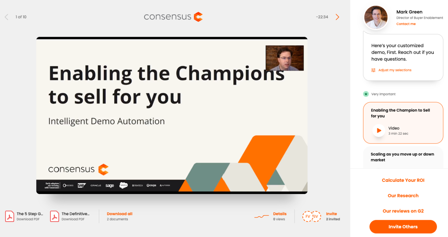
Next, you'll select the language of the Demo Player. This will change all DEFAULT TEXT to the language you've selected. Any text you manually add to the Demo Player will need to be translated by the Demo Creator (Feature Titles/Descriptions, CTA Buttons, Share Demo Button, etc.).
In the next section, you'll add the Contact Information. It's a best practice to keep this contact information generic (don't use your own contact information if other reps will be using this same demo):

The final section is where you'll add your Company logos and colors for your demoplayer.
- You will add four different logos that will appear in different areas of your demo

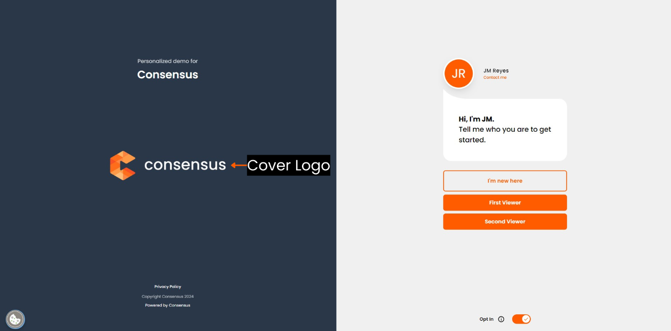
- The Cover Logo appears when the viewer first opens the demo:
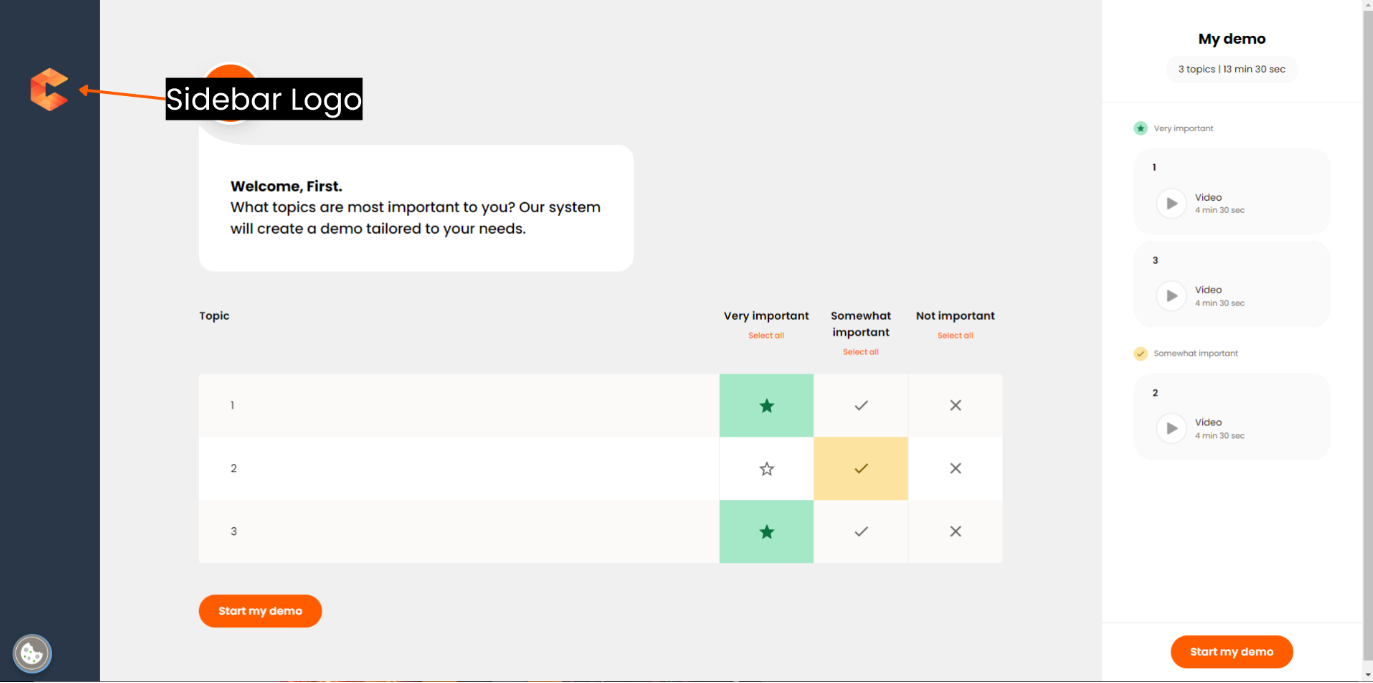
- The Sidebar Logo appears during the Intro Video and while the viewer selects topics:
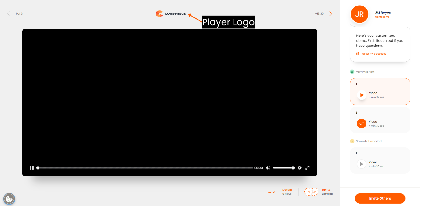
- The Player Logo appears while the viewer is watching feature videos:
- The Favicon Logo appears on the viewer's browser tab:

- Our recommendations for the logos are as follows:
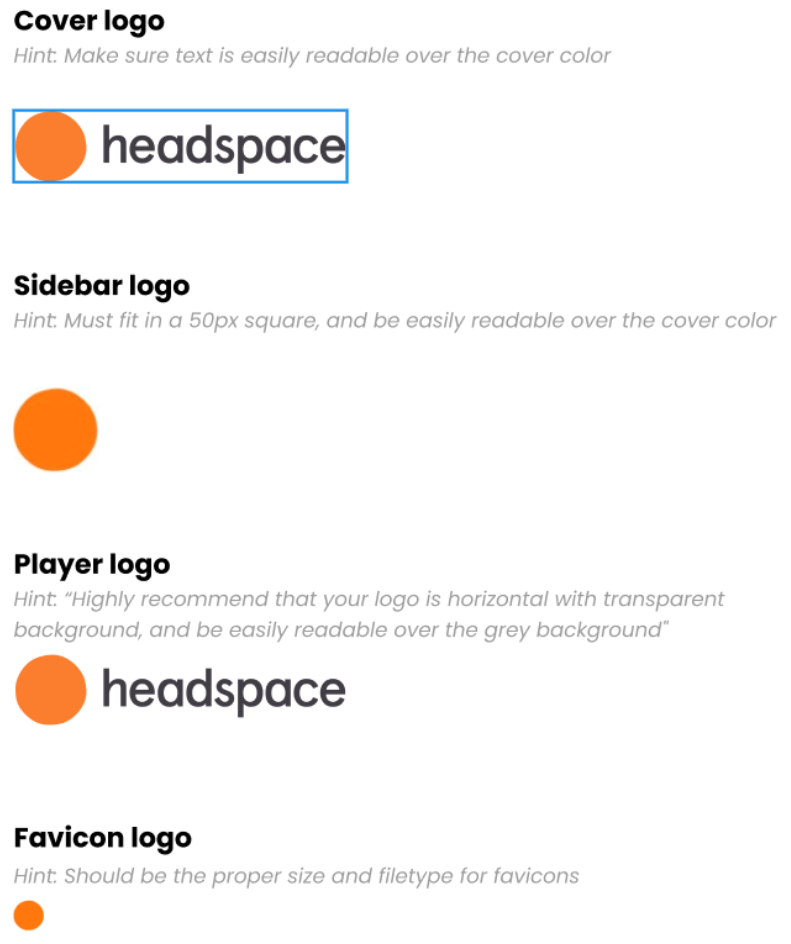
Example logo recommendations
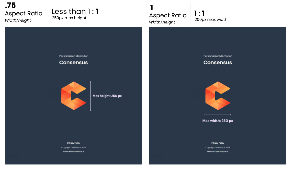
Cover logo guide: You can upload a logo larger than the reference below and it will scale down to fit within the maximum constraints. However, if your logo is too small, it may become blurry or pixelated when enlarged to fit
The logos are dynamic with no size limitations
They are based on aspect ratios
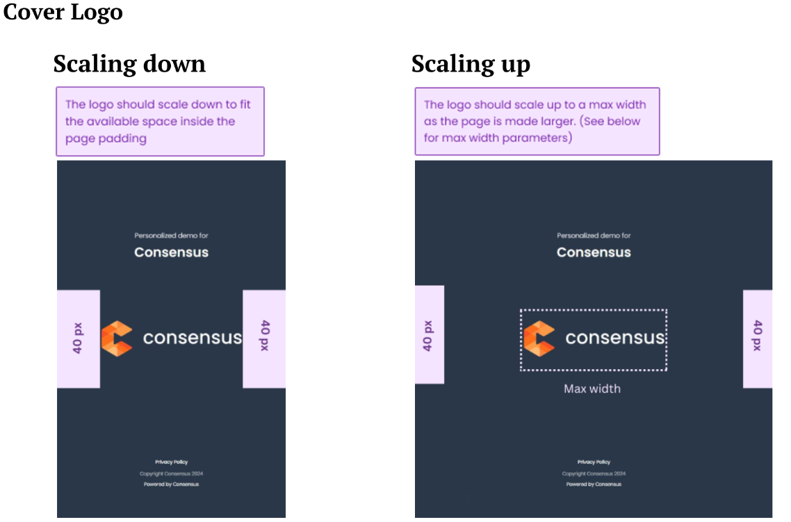
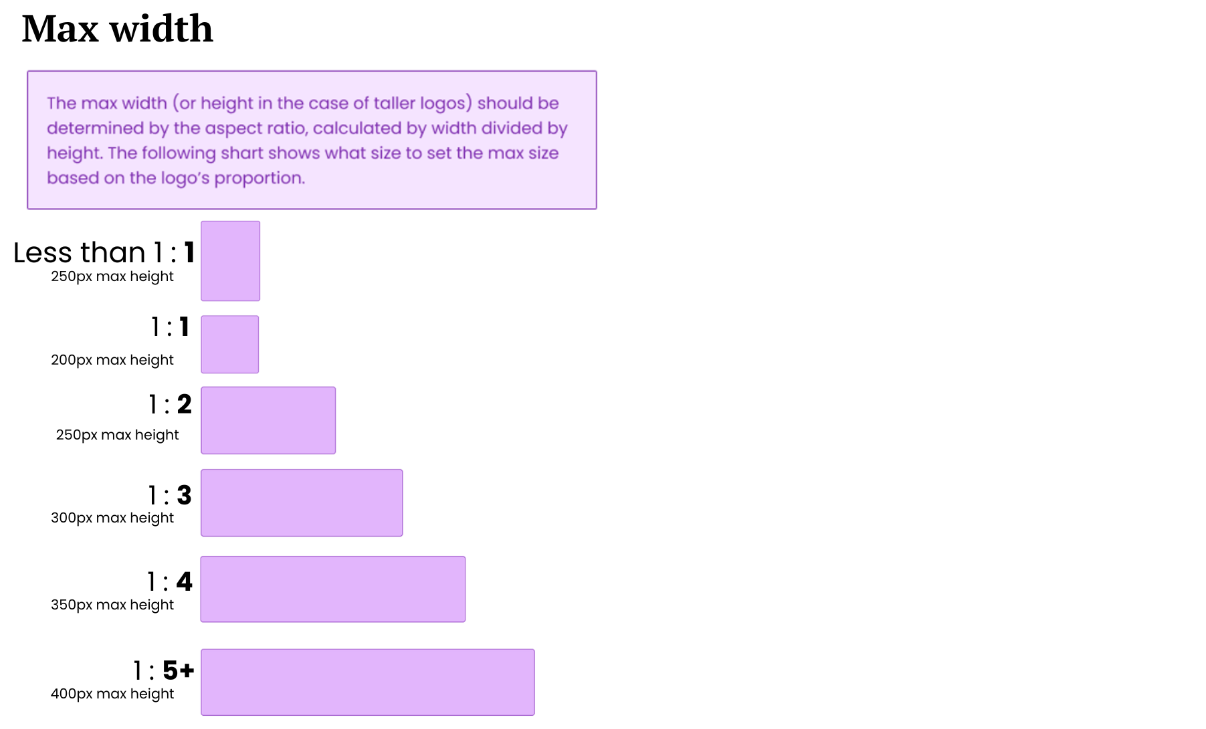
Logo ratio examples
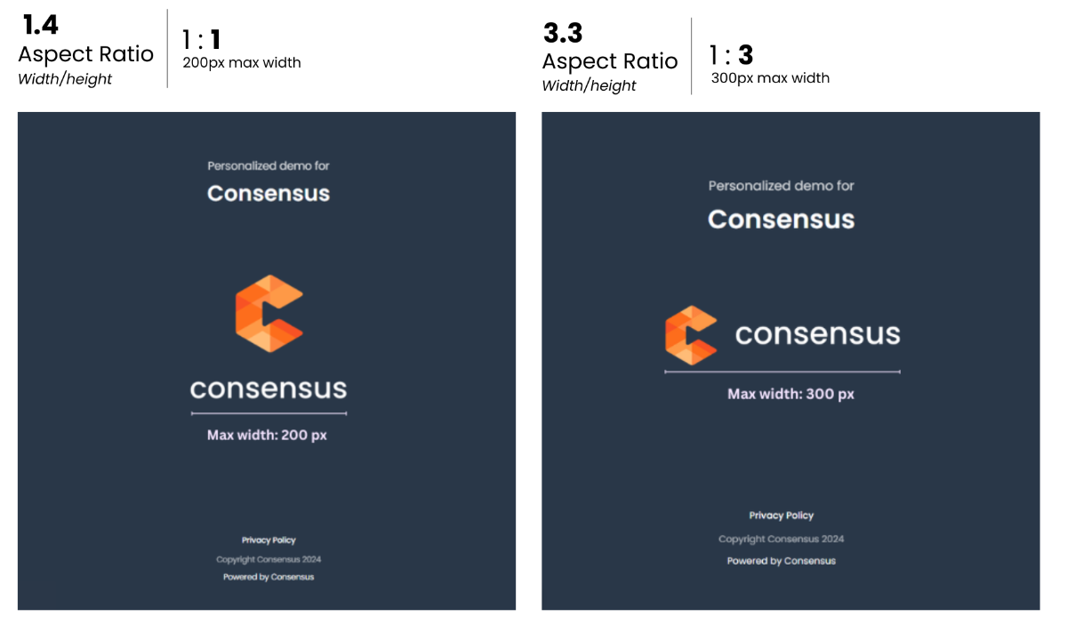
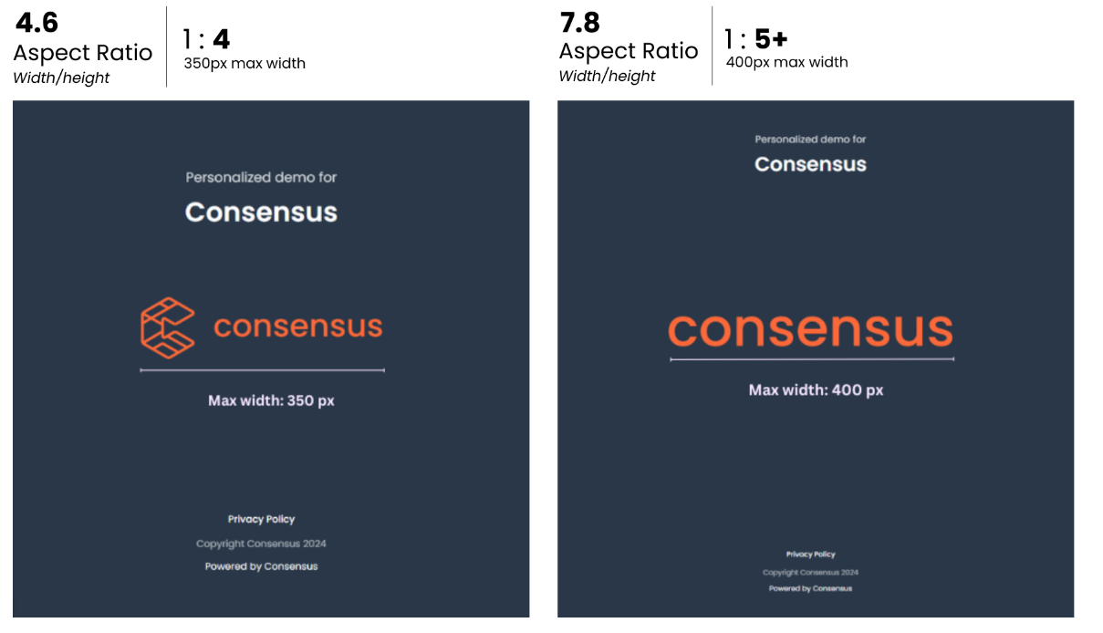
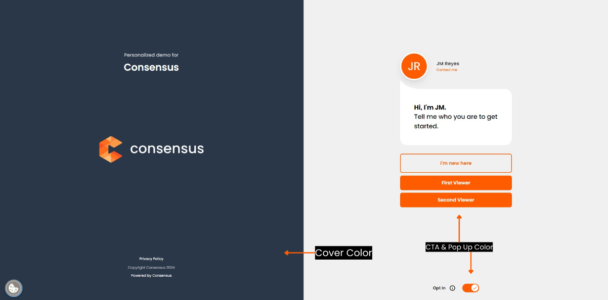
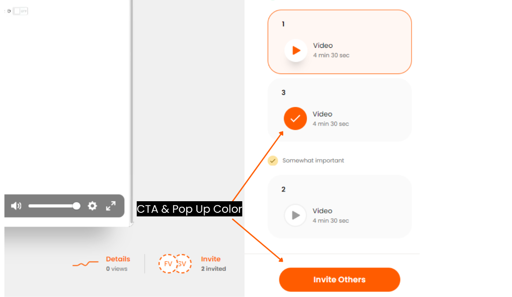
The Final Step is to customize the colors. There are three colors to choose when customizing
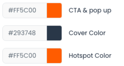
The CTA & pop up color will customize Call to Action Buttons and any pop ups that appear throughout the demo.
The Cover Color will customize the cover page, or first page of your demo
The Hotspot Color will customize your Hotspots in interactive Tours
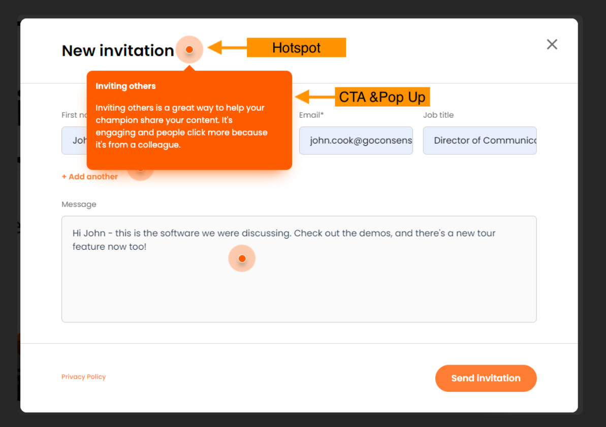
It doesn't take long to add these small details which will help make your Demoplayer look and feel as though it was created with your style/branding in mind.

